
درباره این اپیزود
“Birding has so many connections to type”🦉🐦⬛🦢
Mid-century shifts to clean lines as we situate two more women type designers and their work: Montan by Anna Maria Schildbach (1924–?) and Thomas Schrift and Versalien by Friedel Thomas (1895–1956). We know very little about Schildbach besides her work at Stempel. Thomas was a student at the Handwerker- und Kunstgewerbeschule (BURG) in Halle, Germany, then an assistant at Anna Simons' Munich studio, returning to Halle in 1922 to direct a new printing workshop at BURG Giebichenstein. A bookbinder, printer, designer, she taught for decades at multiple schools.
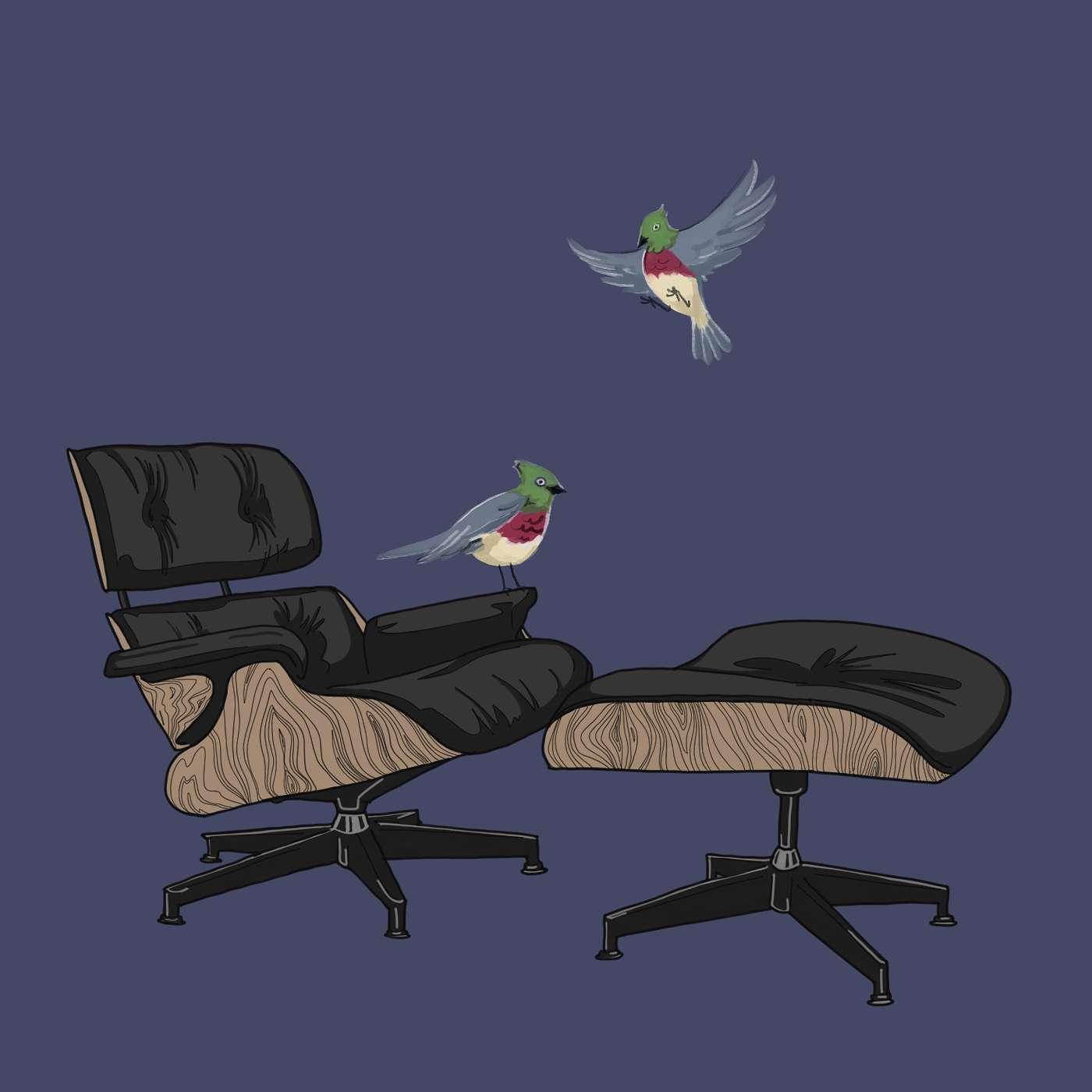
Bethany and Stephen (aka Stewf) talk about wider design trends—Viennese Secession, Bauhaus, Jugendstil, Art Deco, etc—around this mid-20th century modernist period, plus how birds, chairs, and fonts are linked. We consider the craft of type design, Germany’s type foundries, technologies that empower those on the margins, and the joys of Letraset.
Special guest: Stephen Coles, Associate Curator & Editorial Director at Letterform Archive, co-founder of Typographica and Fonts in Use, fan of birds
PSA: The best way to mix typefaces? Contrast.
📚
- Indra Kupferschmid, “First/early female typeface designers,” Alphabettes (2017)
- Gerda Breuer & Julia Meer, eds, Women in Graphic Design 1890-2012 (Jovis, 2012)
- Trajan’s column
- Die Fläche
- Type terms like descenders, swashes
- Montan: Stephen’s post on Montan; more via Fonts in Use, Letterform Archive, Klingspor
- Thomas Schrift and Versalien: Fables etc are in a portfolio + type specimens for VEB Typoart Dresden, 1958 (not online); more via Fonts in Use, Luc Devroye, Typographie.info, Letter Library
Credits
Creator and Producer: Bethany Qualls
Editor: Joe DeGrand
Original episode artwork: Trifoxatops aka Jenna Mauro
Social Media Whisperer: Elizabeth Giardina
Music: "Sneaky Feet" by geoffharvey
Like what you hear? Keep listening! Subscribe to Re(un)Covered wherever you get your podcasts.
Want to chat? Follow us on Instagram or send us an email.